Parked

Make default account in the Admin more obvious

Categories:Admin Tools
  • September 10, 2024
  • 3 replies
  • 54 views

Forum|alt.badge.img+3
  • Troubleshooter

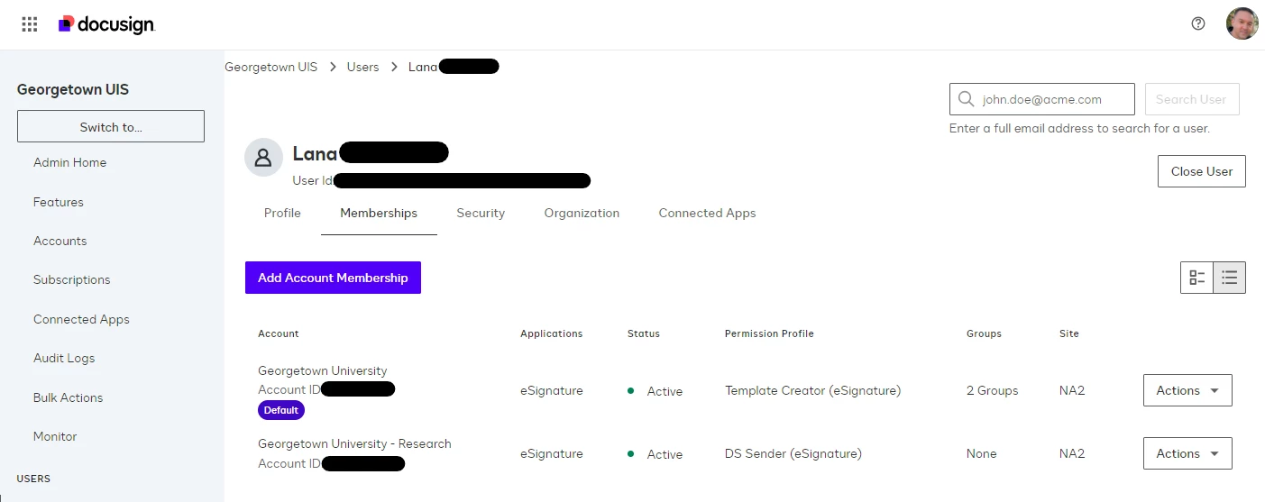
I appreciate with the logo change Docusign is incorporating the purple color scheme in more places. Can you please extend this to the tiny “Default” that’s displayed when a user is provisioned access to more than one account? The current black on light gray is far too subtle.

Current UI:


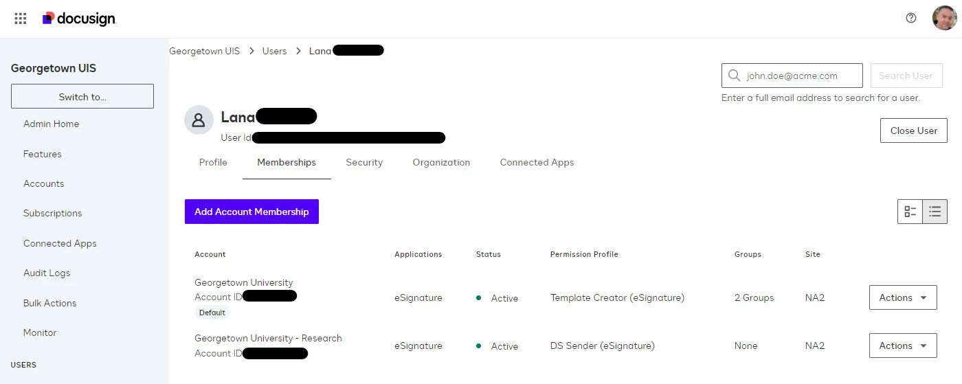
What I’m wishing for:


3 replies

Forum|alt.badge.img+15

Thanks for sharing this idea with us, ​@CDJ. We’ve reviewed it and appreciate the thought behind it.

At this time, we’re not planning to pursue this request, so we’ve marked it as parked. 

While it’s not on our current roadmap, ideas like yours help inform future direction if priorities change.

Thanks again for contributing your input.


Sincerely,

Melanie | Docusign Community Moderator


Forum|alt.badge.img+15
Idea SubmittedParked

Forum|alt.badge.img+3
  • Author
  • Troubleshooter
  • January 2, 2026

Thanks for sharing this idea with us, ​@CDJ. We’ve reviewed it and appreciate the thought behind it.

At this time, we’re not planning to pursue this request, so we’ve marked it as parked. 

While it’s not on our current roadmap, ideas like yours help inform future direction if priorities change.

Thanks again for contributing your input.


Sincerely,

Melanie | Docusign Community Moderator


While Docusign didn’t go with the purple color scheme I suggested, thankfully they did change it from black on light gray to white on black which is much more noticeable.