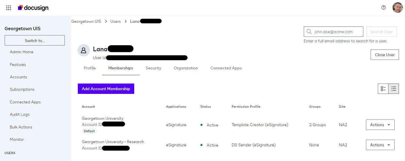
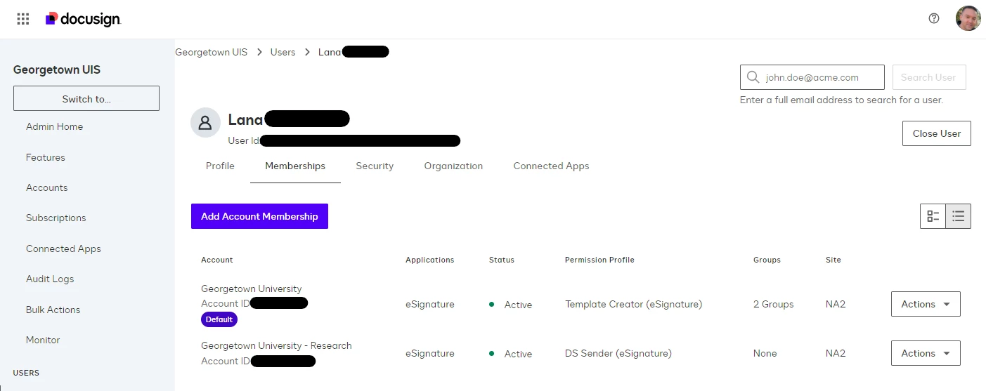
I appreciate with the logo change Docusign is incorporating the purple color scheme in more places. Can you please extend this to the tiny “Default” that’s displayed when a user is provisioned access to more than one account? The current black on light gray is far too subtle.
Current UI:

What I’m wishing for:

 Back to Docusign.com


