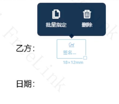
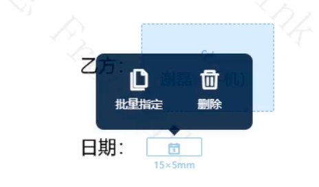
It’s unfathomable to me that a product as developed as DocuSign has you place a signature field in a document without showing you how much space the signed field will occupy.
The variety of documents I work with precludes me from using templates, so I manually place all signature fields. Out of necessity, I've gotten decent at predicting how far above the signature line to put the field, but it’s a bit silly that I’ve had to learn this trick.
I have lost dozens of hours of productivity clicking on the document Preview only to find that I need to move the signature field up about 10 pixels so the signature, reason, time, and verification number won’t overlap with the signature line and title.
I’m no UX designer, but this ought to be a trivially easy change. Instead of the Signature field being an arbitrarily sized box, make the box the exact dimensions that the field will be once it’s signed.
 Back to Docusign.com


