Back to Docusign.com



Idea Submitted
Proposal for visual clarity for shared template folders
I’d like to share some feedback about the visuals of shared template folders. Our company heavily utilizes shared folders, and a recent update has created a lot of confusion. Here are the 2 main issues:
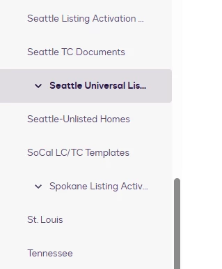
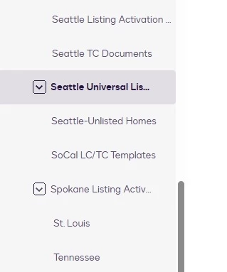
- It’s unclear that the user needs to click on the carrot arrow to expand a folder. They click the name of the folder and it’s not immediately apparent there are subfolders. The carrot doesn’t look like a clickable button.
- It makes it look like a folder that has subfolders is actually a subfolder of the folder above it. For example, in my screenshot it looks like the Spokane Listing folder is a subfolder of the SoCal LC/TC Templates folder, but it is not.
I’ve attached screenshots of the current state and what I think would be a better visual experience.
Thank you!